Case Studies in Communication:
Websites & Data Visualization
Websites
Designed for two different courses, I worked within the limitations of a pre-existing set of parameters to create a visually interesting and well organized website to communicate the projects to our audience.
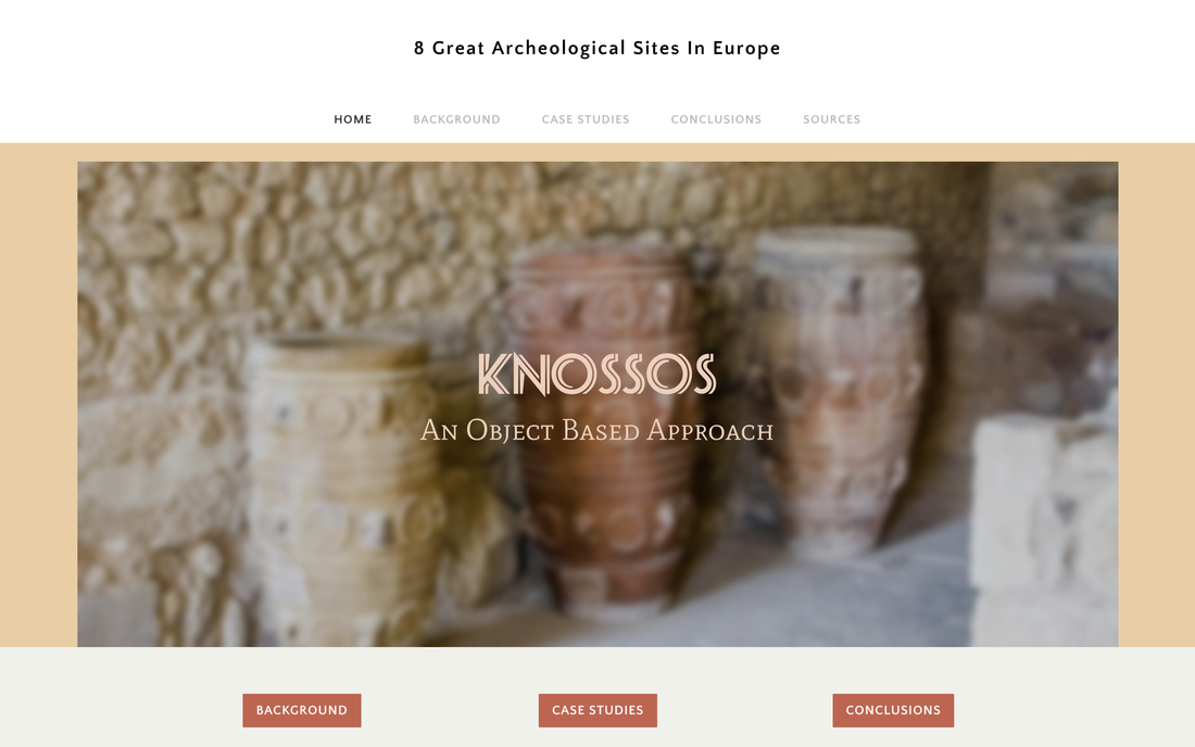
The first one, found here, was a site report on Knossos in Crete. A group project, I designed and built the site structure and led the content, and was personally responsible for the content on the general background page, minoan seal stones, and conclusions. The primary challenge was to make this both a suitable site to present in class, which I led, as well as a stand-alone piece that can communicate to an audience with no prior knowledge of this specific content. To address this we combined well-researched content with a clear narrative arc and a visual style that recalls associations with the Mediterranean and is visually cohesive with the artifacts we chose to display.
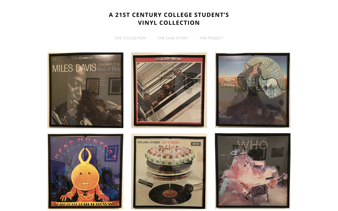
The second, here, was an exercise in using the professor's archeological thinking approach to a modern day object. The challenge was to keep it clean and self contained, in a way forming a visual essay that flowed naturally and supported the content that at times is highly abstract.
These two cases show internal consistency of style and prioritization of clarity of content over visual trickery, and reflect my growth in the use of Weebly editing skills and HTML.
The first one, found here, was a site report on Knossos in Crete. A group project, I designed and built the site structure and led the content, and was personally responsible for the content on the general background page, minoan seal stones, and conclusions. The primary challenge was to make this both a suitable site to present in class, which I led, as well as a stand-alone piece that can communicate to an audience with no prior knowledge of this specific content. To address this we combined well-researched content with a clear narrative arc and a visual style that recalls associations with the Mediterranean and is visually cohesive with the artifacts we chose to display.
The second, here, was an exercise in using the professor's archeological thinking approach to a modern day object. The challenge was to keep it clean and self contained, in a way forming a visual essay that flowed naturally and supported the content that at times is highly abstract.
These two cases show internal consistency of style and prioritization of clarity of content over visual trickery, and reflect my growth in the use of Weebly editing skills and HTML.
|
|
Data Visualization
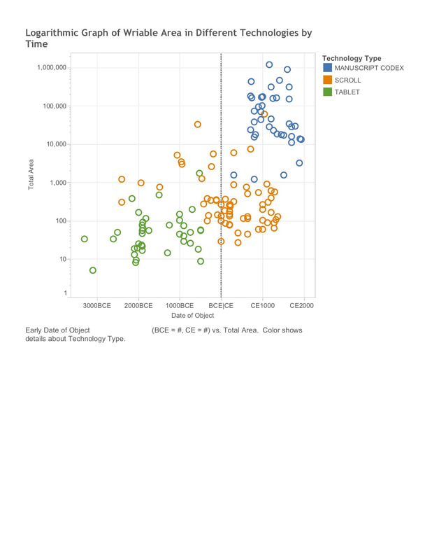
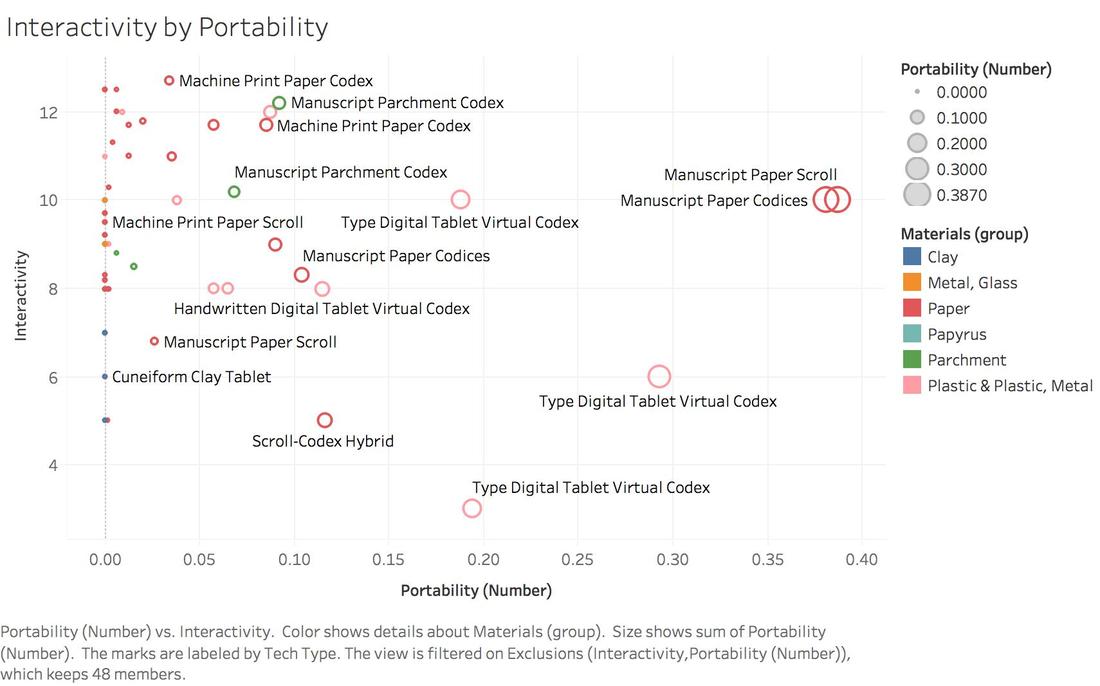
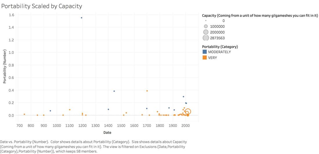
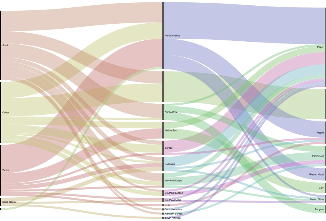
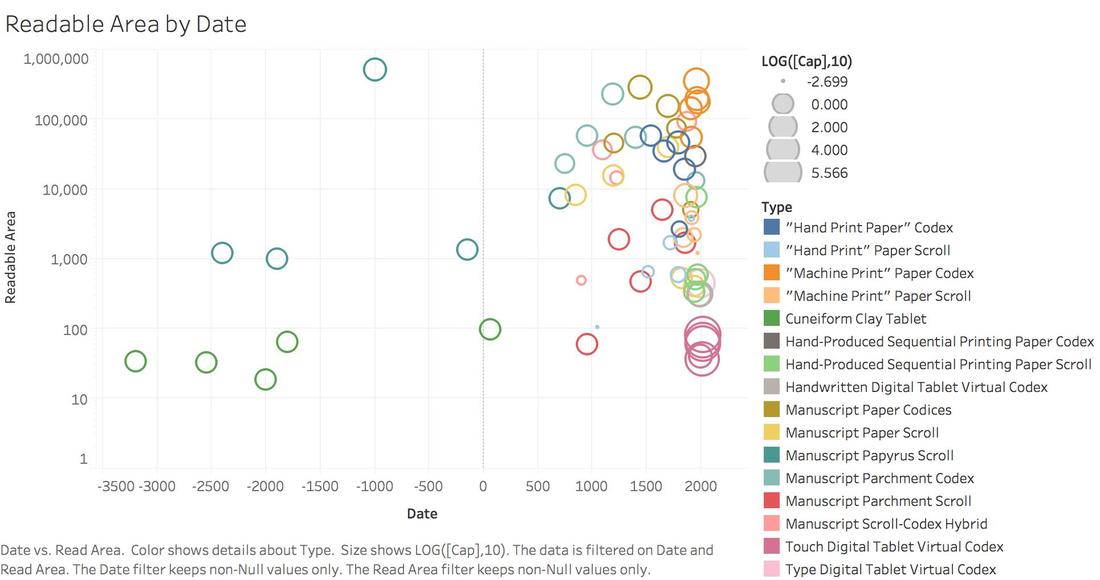
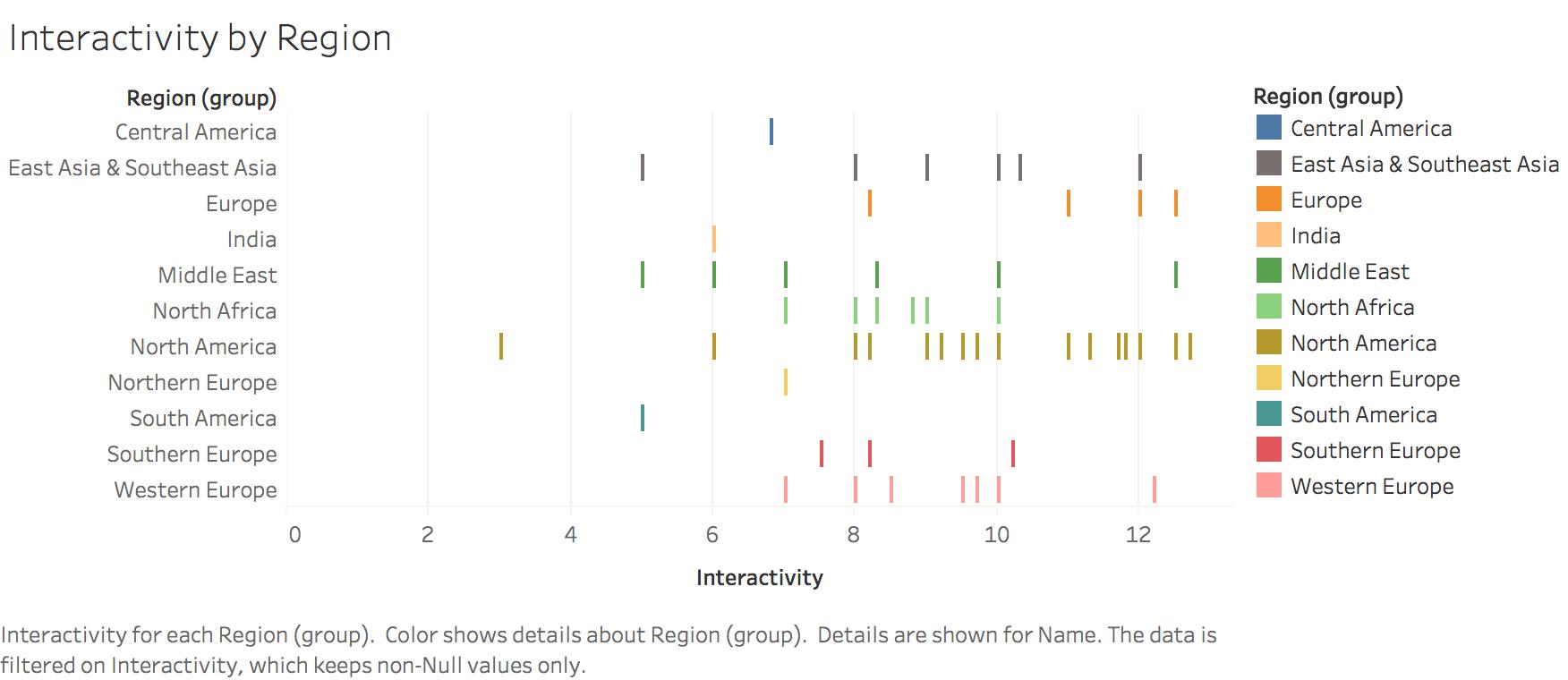
While working at Stanford's Center for Spatial and Textual Analysis, I've been learning to use Tableau to visualize and communicate our data to the director of the project and other members of the community. Here is a selection of the most interesting so far.